Indigo Books and Music App Redesign
The Challenge
Indigo’s App is a smaller more loyal customer base. What are they looking for and how can we give them a enhanced app experience? e-commerce apps offer a unique opportunity for a company to offer a smaller more loyal customer base to
The Who
Indigo’s customers are predominantly female. They know good design and aesthetics are important to their shopping decisions. Indigo has become a life style brand for a defined kind of woman. Our customer is educated, employed, 18-35 (ish), middle class and a knowledgeable consumer. Going to the Indigo store or website is as much about the look and presentation of the products as it is about the products themselves. Seasonality is often what drives our users back to our stores and platforms. The aspirational feelings of excitement for fall, anticipation of the holidays, or the rest and calm of a reading socks day are just as important as actuality of experiencing them. But how do we adapt that for the app?
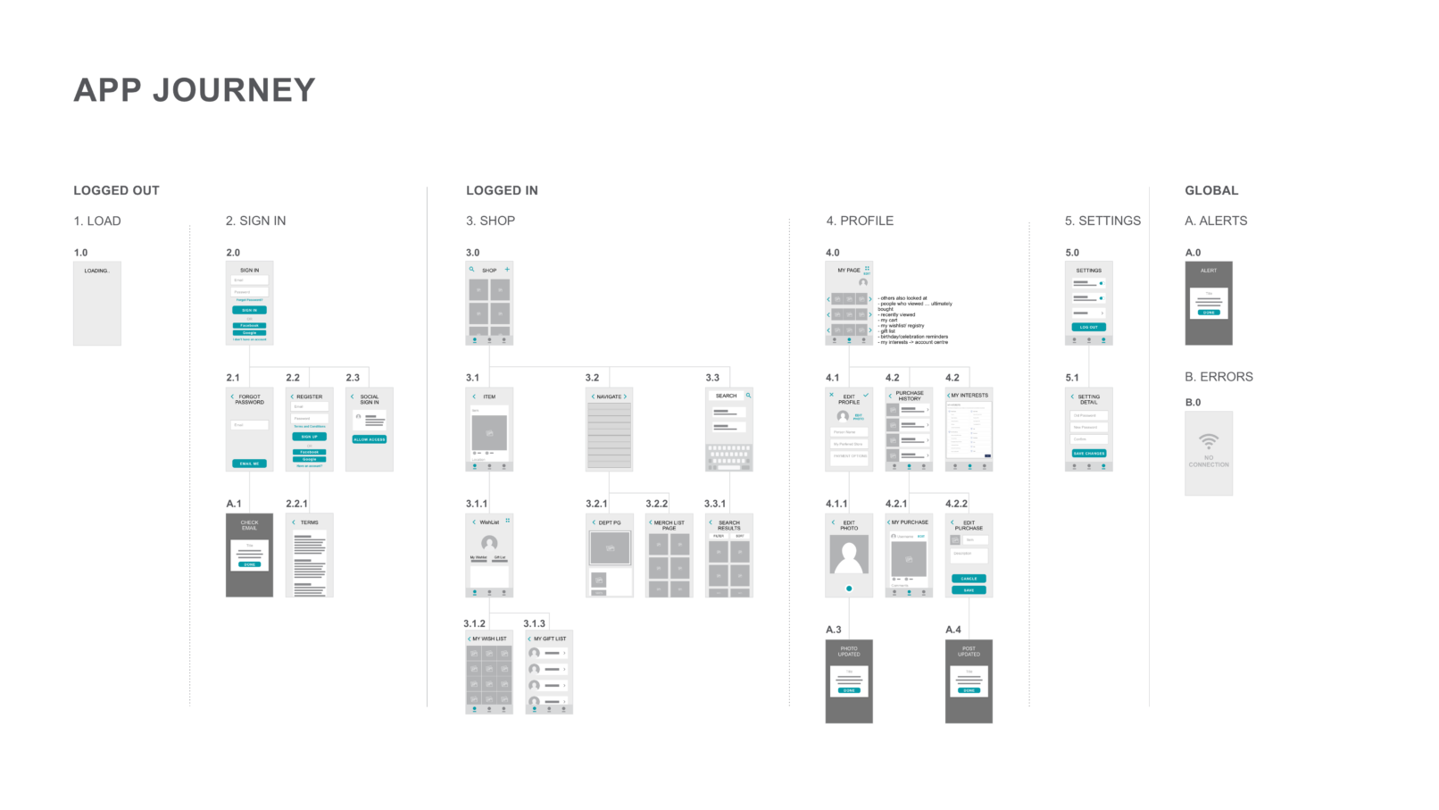
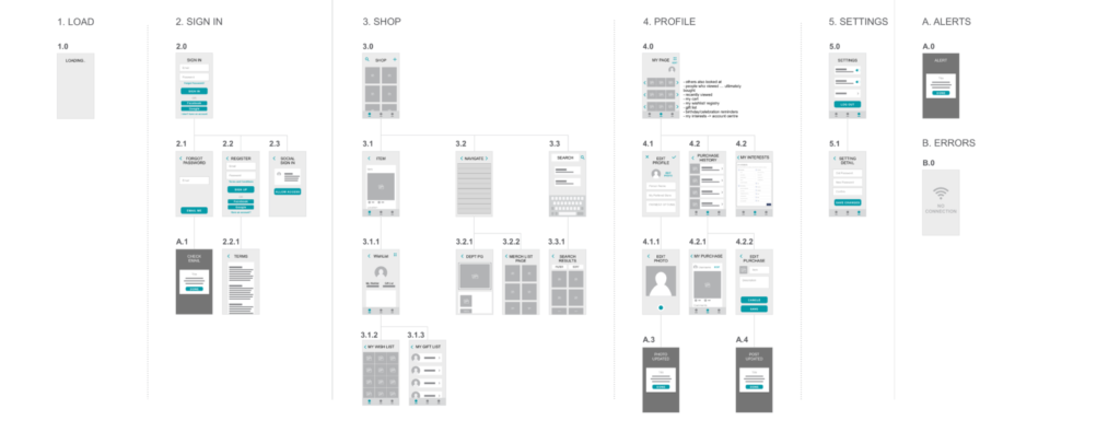
We began by roughly mapping out what pages we needed and defining the main purpose of our app as a retail e-commerce app that would be easily recognizable as a Indigo store.
The Twist
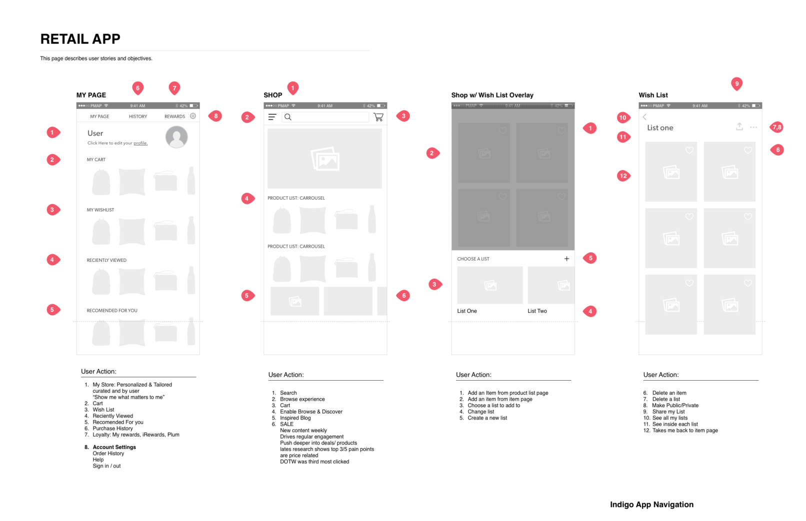
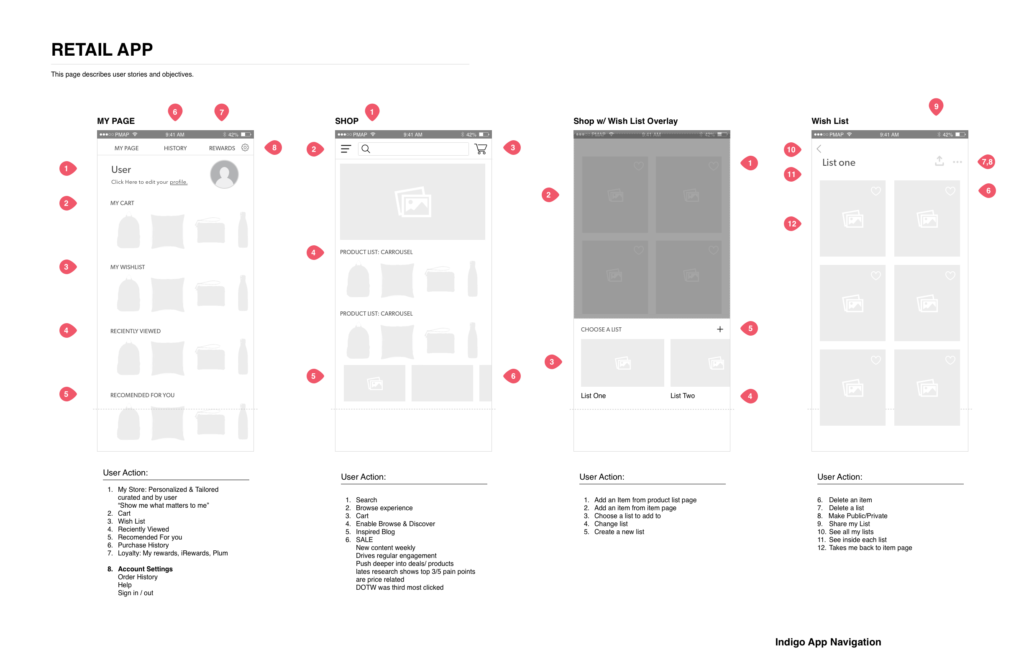
But why download the indigo app? What can we give our customer that she doesn’t already have on the website and store, why should she care? Through solutioning for this we came up with the idea of personalizing the app. By combining the profile page and the home page into a curated experience for our user we could create a personalized product feed based off of what our customers are interested in. This would add real world value to our app.
How can we make it feel personal?
I broke this down in 4 ways:
- First, products saved in the cart
- Then wishlist items
- Recently viewed products
- Finally Indigo’s recommendations for you
I set this order based off of a few key facts. Through testing I found customers were most drawn to images they had already liked and sorted. They also liked to move products between the hierarchy based off their needs. Customers communicated Their interpretations of the difference between these groups:
- Cart: things I want to buy now
- Wish list: things I will buy when I can afford it
- Recently viewed: Products I want to be reminded to look at again
- Recommended: products that are being marketed to me
I think one of the technical limitations we had in this project that could be a huge area for improvement in the future is to take a look at the recommendations algorithm and how it surfaces products.
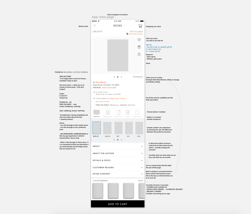
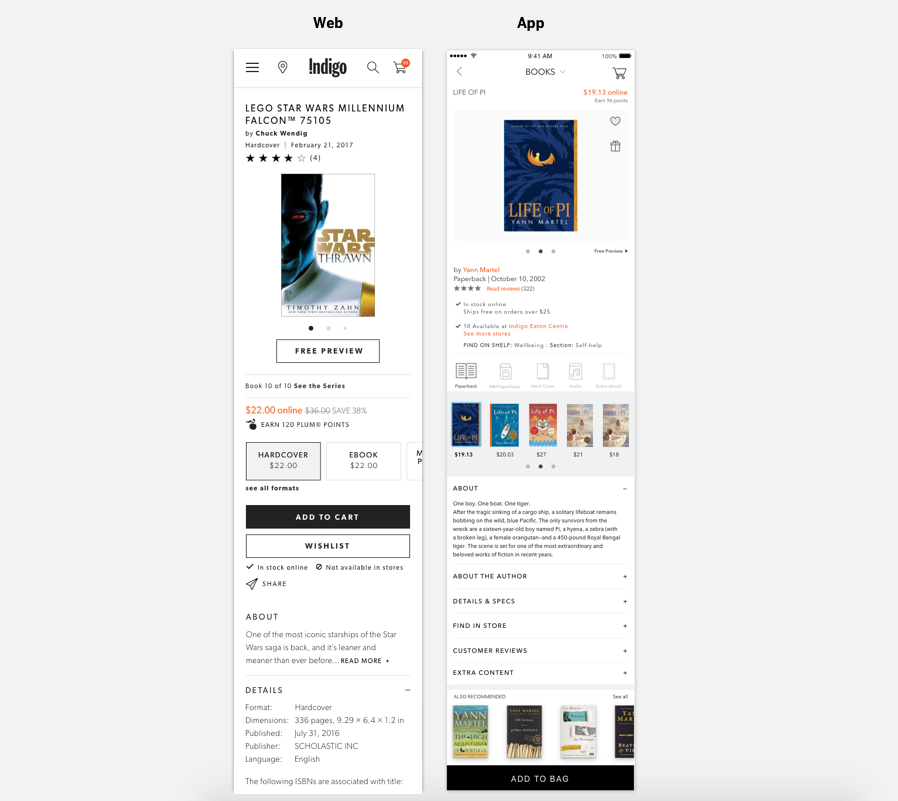
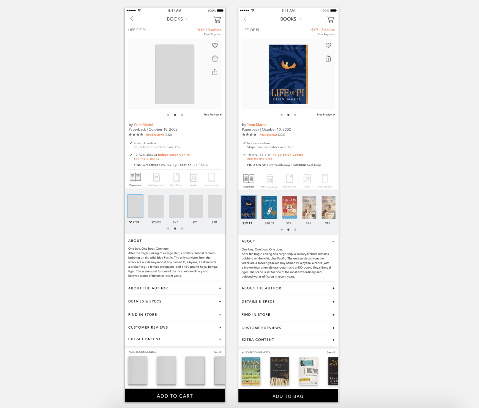
One of the things I really wanted to look at for this app redesign was how could app specific design help us enhance what Indigo is mainly known for – buying a book. Here I found many opportunities. By talking to our users I found that we had lots of what I would call ‘series fans’. Fans that were highly knowledge able about one particular book series and what they really wanted were easier ways to find the detail and exactly the book, which cover art, printing, forward they were looking for. When solutionizing this I knew I wanted to simplify the page with iconography. I also knew that our users often used our app in-store and wanted more kiosk like features. So I wanted to build in a ‘Find on Shelf’ function. Talking with customers I also realized that our format selector was a black hole of endless clicking and new page loads to find what they were looking for. I wanted to create a tabbed carousel where the user could look through images of all the formats we carried. We found that product image and price we all they needed to drill down into the correct format.
