BitmapCreated with Sketch.

Checkout Redesign

2018 Lead UX Designer

Checkout
Redesign
The addition of gift card & promo code redemption, expanding payment options, and driving user engagement. Payment Details Step 3 Gift Card
Gift Card Number
Next

The Challenge

Prior to the implementation of gift card redemption on the LCBO website and app, customers faced limitations when attempting to use gift cards for their purchases, particularly when utilizing the online platform. The absence of seamless gift card redemption within the digital payment process created friction and hindered customers from fully utilizing the value of their gift cards during transactions on the website and app.

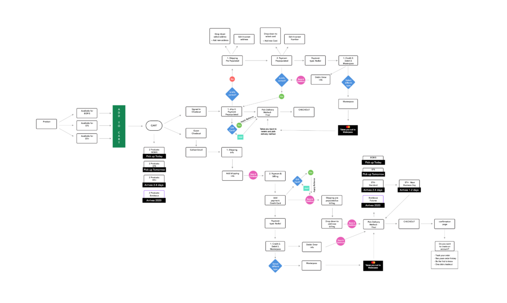
UX Flow Diagraming

Creating a UX flow diagram is crucial first step in redesigning a checkout flow with Buy Online, Pick Up In Store (BOPIS) and multiple payment methods. It provides a clear visualization of the user journey, help identify pain points and enhance usability. By carefully mapping out each step, I can seamlessly integrate various payment options, BOPIS, gift cards, promo codes, and fulfillment processes, ensuring a more intuitive experience. Additionally, flow diagrams facilitate team collaboration and serve as documentation for future updates, making it easier to implement A/B testing. Ultimately, this approach enhances customer satisfaction and increases conversion rates.
Cart Abandonment
0 %

When users cannot recognize a necessary interactivity it leads to incomplete checkouts, increased drop-off rates and frustration as they struggle to proceed without realizing its importance.

Drop-Off / Excessive Steps
0 %

A lengthy checkout process with too many steps can overwhelm users, leading to frustration and increased drop-off rates as they abandon their carts in search of a more streamlined experience.

Potential Revenue Loss
0 %

Not offering promo codes or gift cards on an e-commerce website could result in missing out on potential business. Customers seek discounts and flexible payment options that enhance their shopping experience.

User Pain Points

The following screenshot highlights the main pain points and problems identified on the old Cart. Identifying the issues your users face is crucial for improving the site and increasing retention.

CTA Blindness: When the checkout button is positioned too far down the page, it can get lost from users' immediate view, causing confusion and increasing the likelihood of abandonment as users may not notice or easily access the final step to complete their purchase.
Excessive Copy: Relying on excessive copy to explain features or processes can overwhelm users and detract from the overall design, causing important information to become lost and leading to frustration rather than clarity in the user experience.
Poor Hierarchy: A lack of clear visual hierarchy on the cart page can confuse users, making it difficult to differentiate between essential information (like item details and total cost) and secondary details, ultimately hindering their ability to make informed decisions and complete their purchase efficiently.
Lack of Recognizable Interactivity: When users fail to recognize a necessary step as interactive, they may hesitate to engage, resulting in missed actions and frustration, and increasing abandonment rates. Shipping Cost Redundancy: Repeating the same shipping cost information for each item can clutter the checkout process, leading to cognitive overload; instead, displaying the total shipping cost for the overall order simplifies the experience and enhances clarity for users.
Invisible Checkbox: An invisible checkbox in the cart can create a stumbling block for users, leading to confusion and frustration when they unknowingly miss an important option, potentially resulting in abandoned carts and decreased conversion rates.
Wireframing & Iteration
Wireframing plays a vital role in the ideation process, allowing the team to visualize different layouts and interactions early on. This initial stage fosters collaboration and encourages creative problem-solving as team members share ideas and identify potential user pain points. Through iterative revisions, the team can refine the design based on feedback and usability testing, ensuring that each element serves a clear purpose and contributes to a seamless user experience. Effective teamwork throughout this process is essential, as diverse perspectives lead to more comprehensive solutions, ultimately resulting in a more intuitive and efficient checkout flow that meets user needs.
Designing a
Unified Solution
The primary advantage of redesigning a checkout process that accommodates multiple features concurrently on both web and app platforms presents both significant benefits and complexity. Creating a cohesive user experience that translates to both Web, iOS, & Android while keeping the principals the same but accommodating the native interactions of each operating system is complex and requires meticulous planning and design to ensure that all elements function seamlessly together. Balancing the various payment methods while maintaining clarity and usability, as each additional feature introduces potential points of confusion. To address this, we did multiple rounds of user research and testing, iterating on designs to optimize usability across different platforms. Ultimately, we delivered a streamlined and flexible checkout experience that meets diverse user needs.
Conclusion

Implementing a multi-tender checkout experience on both web and app platforms, including features for Buy Online, Pick Up In Store (BOPIS) and gift cards, has proven to be a transformative step for the business. This integrated approach not only enhances user satisfaction but also streamlines the purchasing process, making it easier for customers to utilize their preferred payment methods. These metrics highlight the positive impact of a well-designed, multi-tender checkout system on both user experience and business performance.

Increase in Conversion Rates
+ 0 %

The implementation of a multi-tender checkout experience led to a remarkable 35% increase in conversion rates, demonstrating that users are more likely to complete their purchases when offered flexible payment options and streamlined processes.

Reduction in Cart Abandonment Rates
+ 0 %

Enhancements to the checkout process resulted in a 25% reduction in cart abandonment rates, indicating that users are finding it easier and more intuitive to complete their transactions without leaving items behind.

Rise in Overall Customer Engagement
+ 0 %

The introduction of a multi-tender checkout experience contributed to a 40% increase in overall customer engagement, reflecting greater interaction with the checkout process and higher utilization of features like gift cards and BOPIS.

© COPYRIGHT 2024  •  All Rights Reserved  •  EMILY DALTON  •  TORONTO, ON CANADA

Skip to content